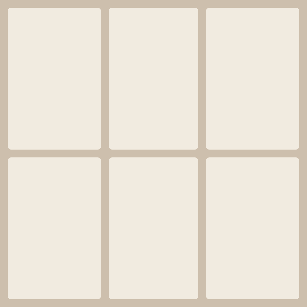


Six is the first count after four that gives an even grid again: the “3×2 grid” sets three columns in two rows. On a square canvas each cell is upright, about 2:3 — exactly the shape of a portrait frame from a camera, so those shots drop in with almost no cropping. Landscape photos feel cramped in this grid; layouts with wide cells suit them better.
With six frames you can start staggering them. In “6: Brick pattern” and “6: Cascading brick” narrow and wide cells alternate row by row like bricks in a wall, so the sheet never turns into a table. “6: Magazine layout” mixes large and small cells like a glossy spread. The one-plus-five layouts, “6: Five-strip column + right hero” and “6: Panorama + five-strip bottom”, work as a storyboard: one main shot and five moments alongside it, like frames on a film strip.
This count works well for a trip recap, where six days or six stops should carry equal weight, and for product sets: six items in a 3×2 grid look like a shop window. To keep the sequence readable, place the photos left to right and top to bottom, the way text is read.